Samsung OS

Challenged with reimagining a mobile operating system from the ground up. Responsible for the architecture, navigation, usability, visual design, user experience design. Our goal was to develop a proprietary Android OS specifically for Samsung phone buyers that differentiate their brand from the rest of Android manufacturers. Final product involved a clean home page that focuses you on what’s most important to you and features a beautiful revolving tile transition to peer into your activity.

Concept Ideation

We started with a comparative analysis across all mobile operating systems by comparing their design, functionality, and philosophies to understand their strengths and weaknesses. From there we found key opportunity areas that we could use as a launching point for our client to truly differentiate themselves.
We then began sketching up innovative interactions to start applying to our design.

Style Boards

After the concept phase, we brainstormed different visual themes that would be interesting, flexible, and supportive of our UX concepts. This was a critical step in our process because there were many pieces of inspiration that helped us to rethink mobile interactions altogether.
We pulled a variety of inspiration, from volumetric, to organic, to flat typography. From there, we picked the most promising directions and started building out our UX concepts with a fresh visual point of view.

Visual Design Details

It’s all in the details. We experimented with different ways of communicating new content to the user.
Explored different levels of hierarchy between content type, images, alert count, sender data, and source of content.

Design Iterations

For this project I was a part of a two person team who worked to totally reinvent the mobile experience by brainstorming, ideating, and rethinking existing paradigms. Our approach started out incredibly exhaustive, making sure we nailed the philosophy and mood. Then we took those themes and translated that into various forms of visual representation, graphics, compositions, transitions, and interaction models that support those goals.

Initial Explorations
Dialing In Details

Final Design

Our final deliverable included a transformed philosophy, clearly defined visual and UX principles, a dramatically redesigned framework, value proposition and key scenarios that illustrate the visual and interaction language.

Core Experiene
Folders as Aggregators
Volumetric Rules
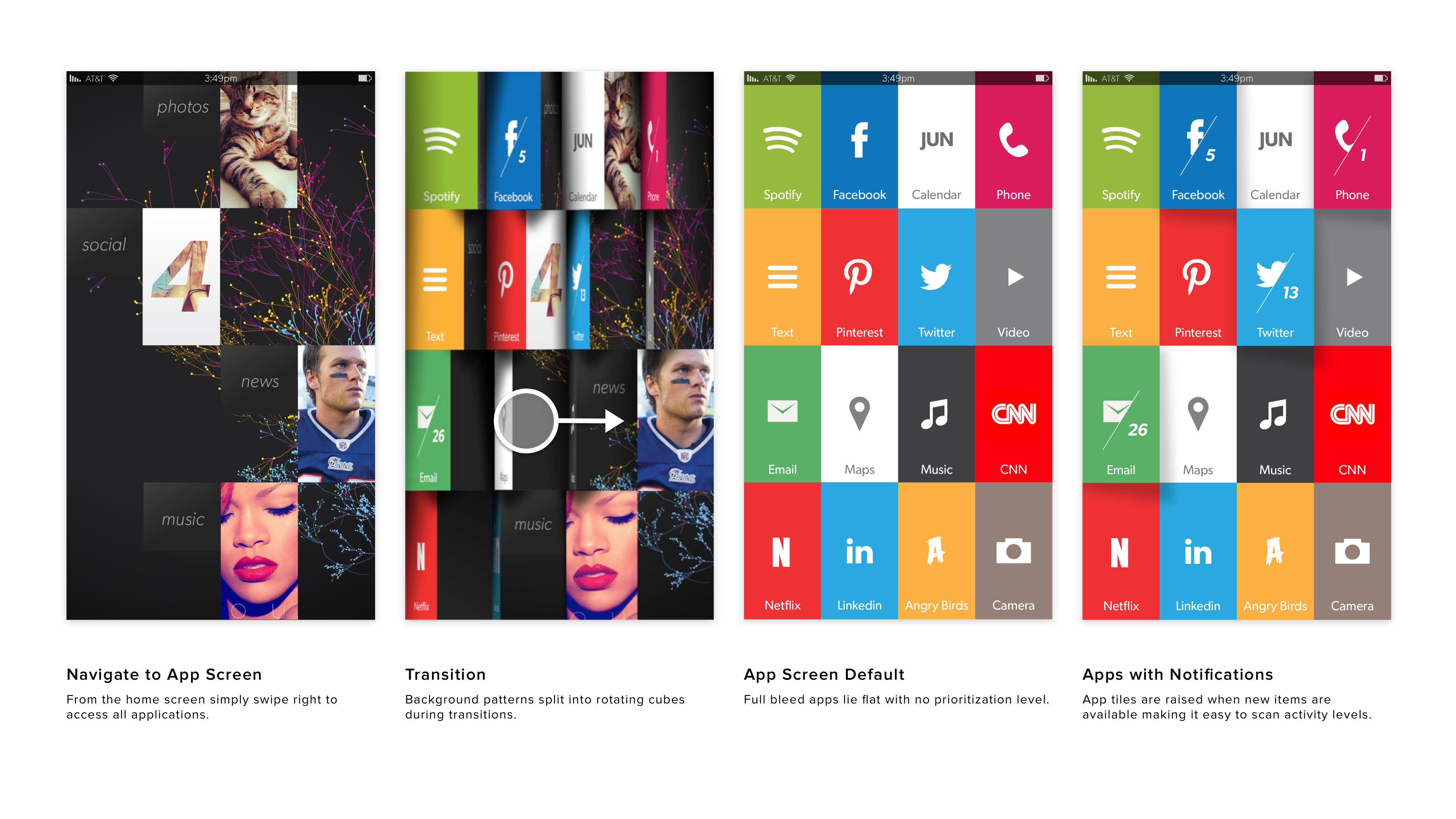
App Screen + Notifications
App Organization
Motion Design

Core Philosophy

Slow down, get back to basics, and focus on what's important.

Visual Design Principles:

Room to breathe. Negative space provides a sense of breathing room in the experience that makes it feel more calm and soothing.

One thing at a time. Focuses on the most important information,
one item at a time, to reduce stress, find balance and create a soothing, calming experience.

Peripheral information. Displays information that can be consumed ambiently and without disruption.

Zero clutter. Removes all unnecessary visual and UI elements such as edges and borders to reduce clutter and make the experience simple and clean.

Grounded in nature. Applies natural elements such as gravity, volume and physical materials that bring you back to the natural world.

UX Concepts:

My content on my terms. No more wasting time searching through a sea of apps. The most important and timely content is delivered to me no matter what app it’s coming from.

No place like home. Minimize app launching. Get incoming information and take action on it from your home screen without having to launch the full app.

Ambient apps. No more searching for new apps. Apps come to you when you need them so you can focus on doing the things that are important to you.